
5H is a privately-funded investment company with the purpose of acquiring mineral, royalty and overriding royalty interests in the most prolific oil and gas basins in the United States. The client requested a cattle-branding aesthetic with a modern twist to carry across all user-experiences.
THE LOGO
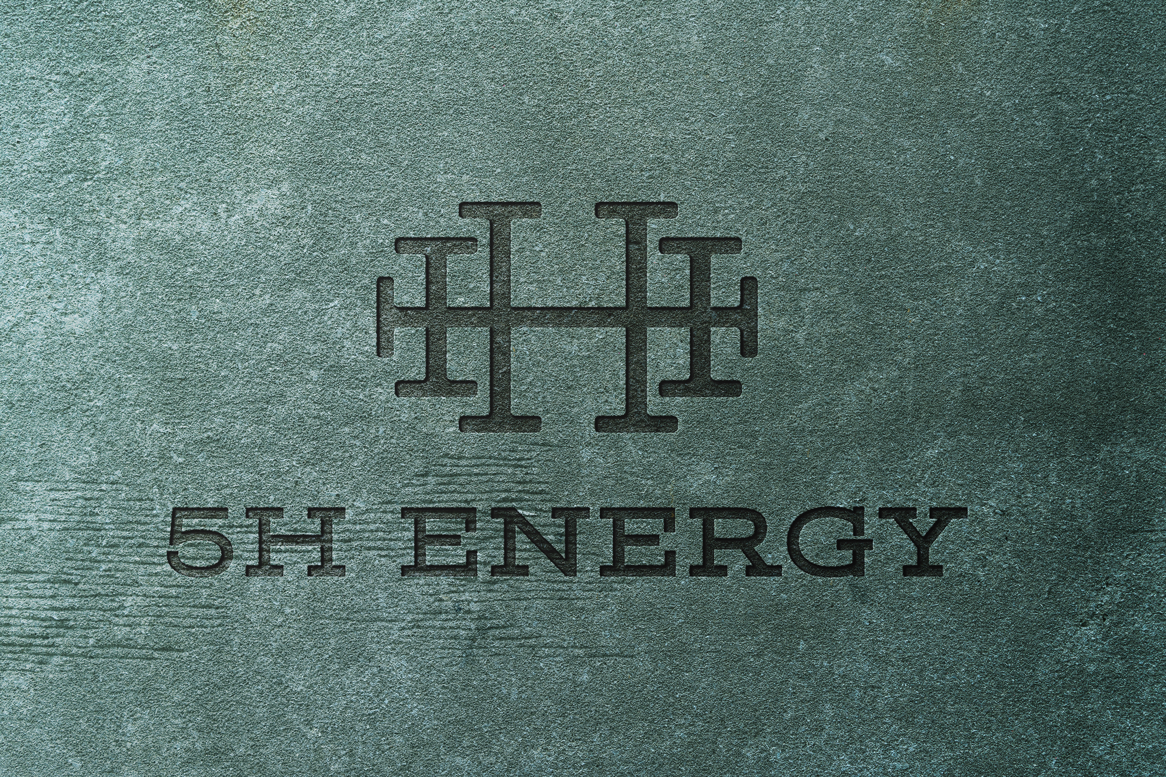
The logo for 5H Energy is a combination of the relationship between the icon and type treatment for the brand. The icon and type have a strong connection through the commonality of the strong slab serifs used, alongside the sharp 90 degree angles of the main letterform strokes.
The icon is a unique mark that reflects the literal name of the company. By using five marks, I was able to arrange them in a way to resemble the structure of five tally marks, but with a horizontal fifth line opposed to a diagonal one. Due to this orientation, it allows for the center of the icon to create the letter H.